
There are so many burgundy paint colours to choose from these days, aren’t there? Gone are the days when red paint meant either bright pillar-box red or a simple terracotta. These days, burgundy paint colours are so varied. From deep wine-red shades to rich plum-toned burgundies with hints of purple.
Burgundy is no longer the preserve of traditional dining rooms either. Depending on what shade you use — and the colour pairings you choose — burgundy paint can be sophisticated. It can be cosy and cocooning. Burgundy can be luxurious — or grounding and earthy.
Quick View of What You'll Find on This Page
What Is The Most Popular Shade of Burgundy Paint?
Burgundy paint is experiencing a high now. As one of the key colour trends for 2025, there’s been a surge in interest in these deep, wine-inspired hues. Benjamin Moore even named ‘Cinnamon Slate’ — a heathered plum with burgundy undertones — as their 2025 Colour of the Year, signalling the shift towards warmer, more grounding tones in our homes.
The popularity of burgundy paint stems from a combination of factors:
Versatility
Burgundy comes in such a vast range of tones and shades. From soft, dusty — almost pink — hues that work as sophisticated neutrals, to deep plum-burgundies with purple undertones. This gives us much more scope to pick a shade to suit our style. And for every kind of room too, from an intimate dining room to a cosy bedroom.
Positive Associations
Burgundy is linked to luxury, warmth, and comfort. It can also evoke feelings of sophistication and timeless elegance. There’s something inherently welcoming about these rich, wine-toned shades.
A Sense of Modernity
Deep burgundy paint colours can add a sense of drama and intimacy to a space whilst still feeling contemporary. This makes them a fantastic alternative to the cooler greys and deep navy blue paints that have dominated interiors for the past decade.
Even though bold burgundy shades are incredibly popular, the real trend lies in the earthier, more complex tones. These burgundy paint colours create a unique yet inviting atmosphere that feels both current and timeless.
How to Choose The Best Burgundy Paint For Your Home
Burgundy is unlike any other colour as, with the addition of blue, brown or more red in the mix, it can vastly change the shade — and also the way the colour can make you feel. For example, add more blue and you’ll be left with a purple-toned burgundy. More brown and you’ll see a chocolate-burgundy.
So which shade is right for your project?
Start off by evaluating the room you want to paint. Which direction does it face?
South-facing rooms naturally get more light during the day, so burgundy shades can appear more vibrant and intense. A south-facing room could take a deeper, plum-toned burgundy that will be beautifully enriched by the golden light.
Equally, if your room is north-facing, a warmer, red-toned burgundy would work beautifully to give the illusion of warmth and cosiness. That said, if you want to really embrace the dark and create a cosy, cocooning space, a deeper shade with brown undertones would be perfect.
Warm Burgundies
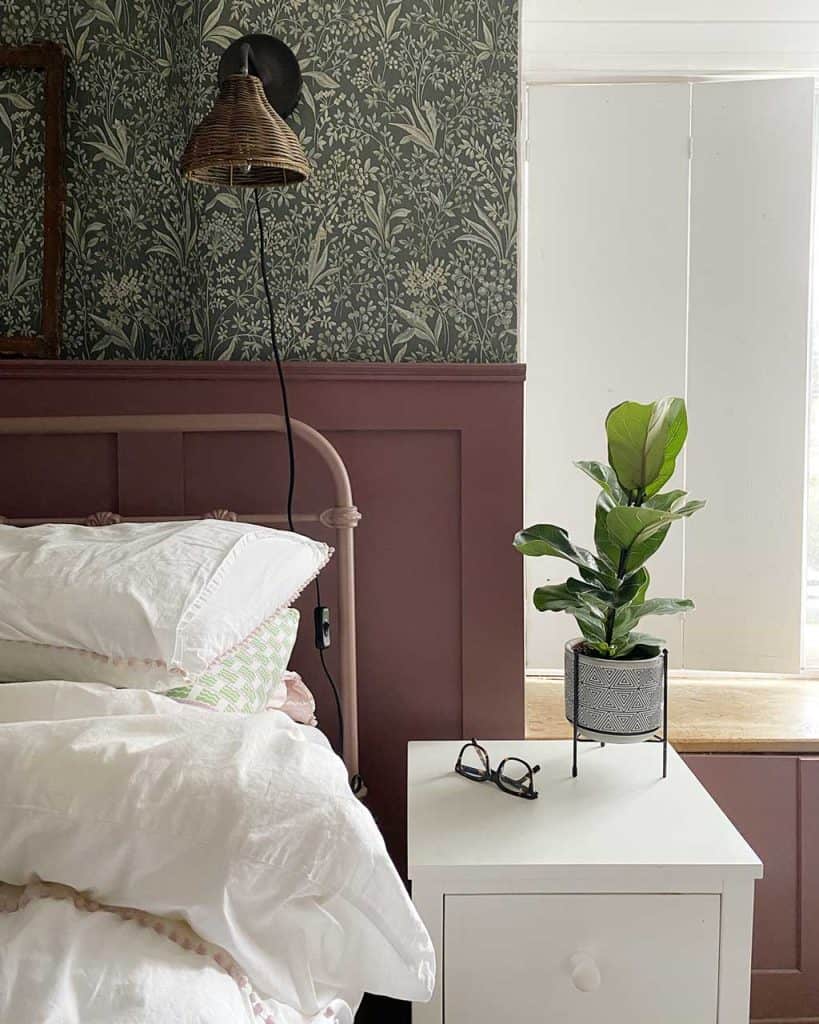
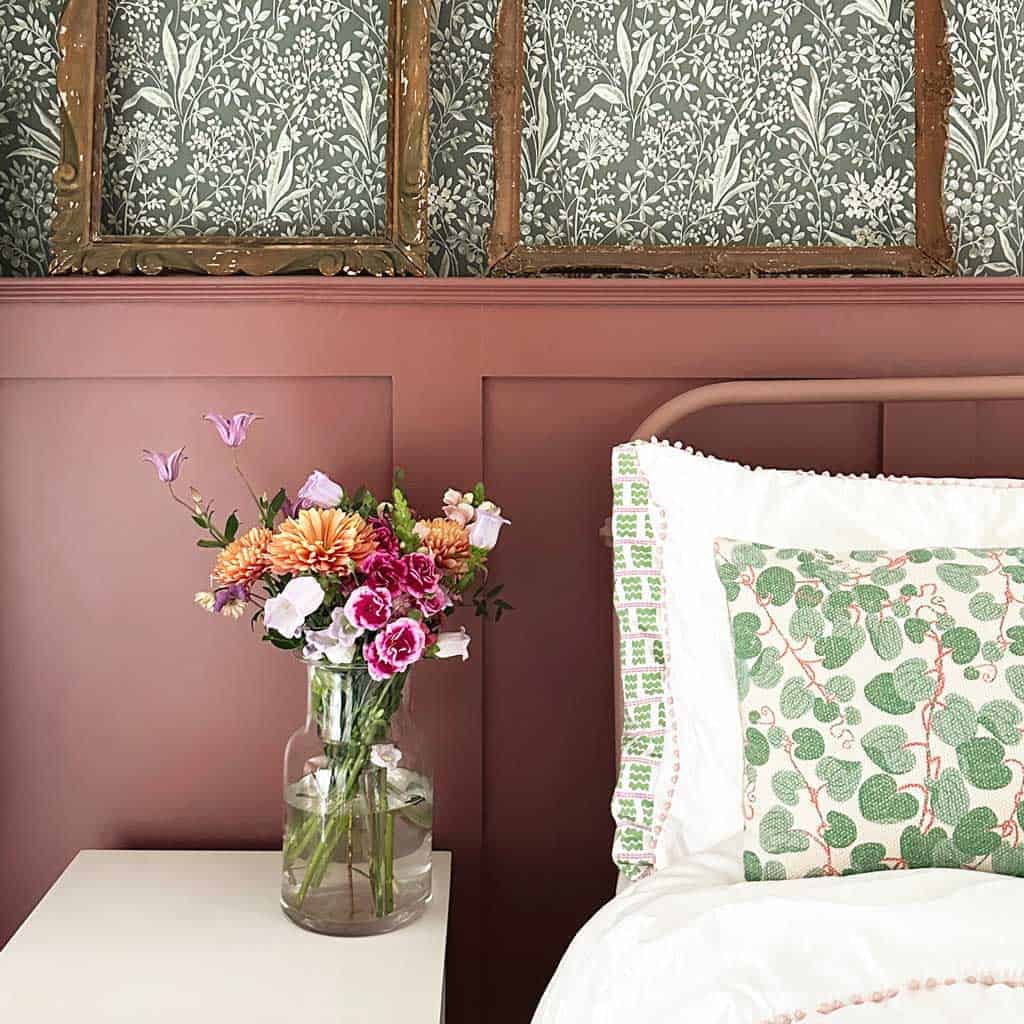
Red-toned, earthy burgundies, such as Little Greene Arras, offer a real sense of warmth and grounding. These burgundy paint colours work really well for north-facing rooms, bedrooms, or dining rooms where you want to create an intimate and welcoming atmosphere.
Cool Burgundies
Cool burgundies with purple or plum undertones (Dunelm Deep Mulberry is a good option) offer elegance and sophistication. Again, these work particularly well in south-facing spaces that receive plenty of natural light, as the warmth of the sun will balance the cooler tones beautifully.
Chocolate Burgundies
Burgundy paint colours with brown undertones — think Tikkurila Rooibos — create incredibly rich, grounding spaces. These shades are perfect for practical spaces like kitchens, pantries, or bootrooms where you want depth and character without the intensity of a true red.
12 of the Best Burgundy Paint Colours
Because the colour burgundy has such a wide spectrum, in this roundup of twelve, I’ve included warm wine-reds, plum-toned purples, and chocolate burgundies to suit every taste and interior.
Here are 12 of my favourite burgundy paint colours to suit every interior.

1. Arras by Little Greene Paint Company

This is a classic earthy red burgundy that feels perfectly at home in period properties. Of ‘Arras’, part of the National Trust collection, Little Greene say it’s a warm-toned, naturally occurring red that adds cosiness and intimacy to spaces.
This is a wonderfully balanced burgundy — not too vibrant, not too purple, not too brown. It’s the Goldilocks of burgundy paint colours. Perfect for creating a sophisticated, vintage-inspired look whilst still feeling contemporary.
2. Etruscan Red by Farrow and Ball

Etruscan Red is a deeper burgundy with chocolate-brown undertones. It’s a grounding shade that works beautifully in more practical spaces.
This shade looks particularly stunning in kitchens or pantries where you want depth and sophistication. In well-lit spaces, it reveals its burgundy tones beautifully, whilst in dimmer light it appears richer and more chocolate-toned. A wonderfully versatile choice for cabinetry.
3. Red 06 by Lick

Lick describe Red 06 as ‘a deep wine-red with warming burgundy tones.’ In their signature smooth matt finish, this full-bodied hue is deep, rich and utterly delicious.
This is a true wine-red burgundy that works beautifully for colour-drenching schemes. Perfect if you want to embrace the trend for deep, saturated walls that create intimate, cocooning spaces. A modern take on burgundy paint that feels fresh and contemporary.
4. Tyrian Plum by Annie Sloan
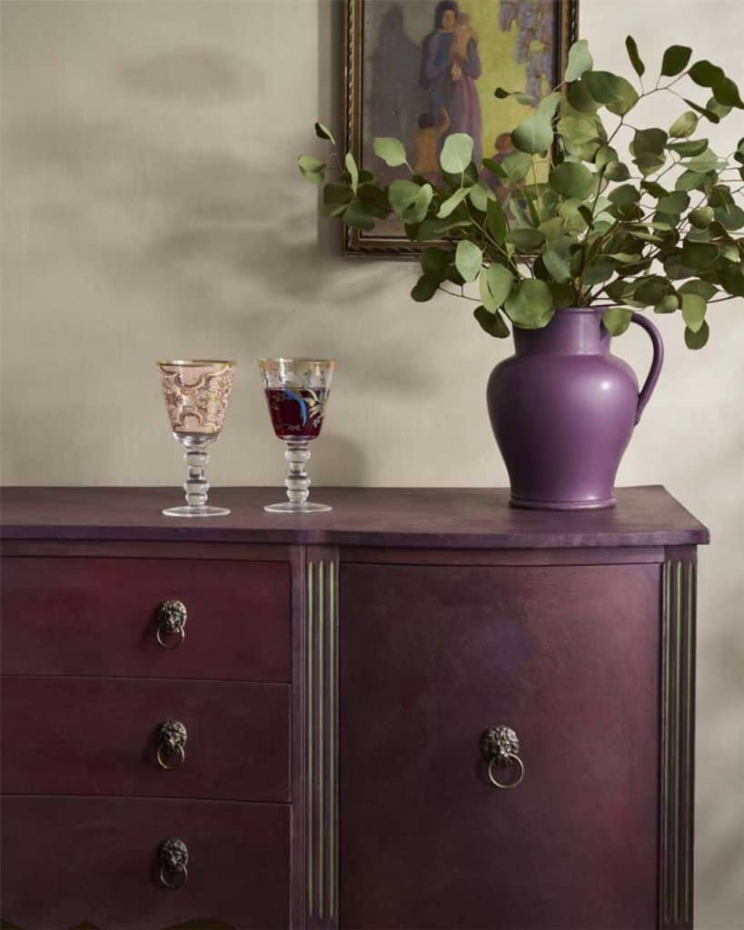
Tyrian Plum is a sophisticated earthy dark reddish-purple with real warmth and depth. This rich jewel-toned plum has both maroon and red elements, creating a dramatic burgundy shade that’s utterly captivating.
Annie’s homage to the ancient Tyrian purple pigment reserved for Roman emperors, this deeply saturated shade works beautifully on painted furniture or as a wall colour. Perfect for updating vintage furniture pieces, painting kitchen cabinetry, or creating an indulgent atmosphere on walls. A truly luxurious burgundy-plum that adds instant sophistication.
5. New London Burgundy by Benjamin Moore
This is a classic, sophisticated burgundy with violet undertones. Benjamin Moore describes New London Burgundy HC-61 as adding ‘sophistication and refinement to any space.’
The purple undertones give this shade an elegant, almost smoky quality. It works particularly well with earthy tones like beige or taupe, creating a feeling of rustic warmth. Choose a matte finish for an almost chalky appearance that softens the bold colour beautifully.
6. Divine Damson by Graham & Brown

Graham & Brown’s Colour of the Year 2026, Divine Damson, is a dark, moody plum-burgundy that evokes luxury and timelessness. This deep damson shade is versatile enough to suit a variety of styles and environments.
A perfect deep burgundy-plum for those wanting to stay ahead of the trends. The damson undertones give it sophistication and elegance whilst still maintaining that characteristic burgundy warmth. Pairs beautifully with gold and brass accents.
7. Rhubarb by Paint & Paper Library

The Paint & Paper Library say Rhubarb is ‘a fabulous Luis Barragán Mexican pink. It can be strong and modern or old-fashioned and traditional.’
This is burgundy at its most vibrant and confident. And whilst they call it pink — and against the other shades on my burgundy paint colour palette above, it really does look pink — it’s really a deep coral-burgundy that makes a bold statement. Perfect for those who want drama and aren’t afraid of colour. Works beautifully both as a hidden surprise inside kitchen cupboards or as a full room statement.
8. Deep Mulberry by Dunelm

If you’re hunting for a burgundy that doesn’t shout ‘red wine,’ Dunelm’s Deep Mulberry is a quietly bold alternative. It slips into that moody, jewel-toned realm, while retaining the richness you expect from a burgundy shade. In a matt emulsion finish, it delivers strong coverage and dries smoothly, making it ideal for accent walls, alcoves or even feature ceilings.
Upgrade to the eggshell variant and you’ve got a version suitable for woodwork, radiators or doors too. That version resists steam, grease and mould, and carries a low-odour, low-VOC formula—perfect for rooms you want to feel cosy but still breathable. In natural light, Deep Mulberry leans a little more plum; under warm lighting, it nudges mustard and burgundy. Pair it with creams, deep taupes or even mottled greens, and you’ll get a palette that’s moody, elegant and surprisingly flexible.
9. Rooibos M476 by Tikkurila

With its deep burnt red character, Rooibos M476 makes an instant impression. This burgundy hue leans closer to purple, making it a fine choice for living spaces, dining areas and bedrooms alike.
If you want to create a cocooning space, use this as your primary wall colour. The purple undertones give it a sophisticated edge whilst still maintaining that characteristic burgundy warmth. Pair with subtle neutrals for balance.
10. Borscht by Sherwin-Williams

Named after the famous Eastern European beetroot soup, Borscht SW 7578 is deepened with tones of beet, creating an elegant burgundy that is a sophisticated alternative to brick red. Sherwin-Williams featured this as their Colour of the Month, celebrating its rich, wine-inspired depth.
This elegant hue is reminiscent of deep red wine and pairs exceptionally well with creamy whites, soft greys, and muted greens for a harmonious and modern look. Borscht adds a touch of luxury to any space and works particularly well with neutral accents such as trim around a doorway or staircase. A timeless burgundy that brings warmth and sophistication to both interior and exterior projects.
11. Highland Peat by Fenwick & Tilbrook
I have a real soft spot for this colour.
Highland Peat sits somewhere between brown, red and pink depending on the light. Fenwick & Tilbrook describe it as ‘a beautiful warm earthy red, naturally inspired and reminiscent of the gorgeous Scottish wilderness.’
This is one of the most interesting burgundy paint colours on the market. In the tin, it looks like deep rust or brick red. But once it’s on the wall and the light hits it, it transforms into a gorgeous deep rose-burgundy.
Absolutely magical.
12. Refectory Red by DeVOL

Refectory Red is a very traditional colour that was often used in country house kitchens. This rich, deep red works anywhere and has the ability to make a piece of furniture or cabinetry instantly feel grand and smart.
DeVOL describe Refectory Red as wonderfully evocative — easy on the eye, rich and classic. It’s also remarkably versatile, looking just as good in a dining area or laundry room as it does in a kitchen. Part of their Shaker paint collection, this furniture paint has an authentic satin sheen perfect for traditional cabinetry. Mix with black granite or slate for a truly authentic look, or pair with warm yellows for a beautiful contrast.
What Colours Go Best with Burgundy Paint
As burgundy is so varied in tone and hue, pairing colours really depends on what shade of burgundy you’re working with. Warm burgundies? Cool plum-burgundies? Chocolate-burgundies? There’s such a vast divide between these shades.
However, there are some classic combinations that work beautifully:
Classic Pairings
Burgundy and white — For a truly classic look, combine burgundy on the walls with white woodwork. This creates contrast and prevents the space from feeling too dark.
Burgundy and cream or beige — For a softer look, pair burgundy with warm neutrals to minimise contrast and create harmony. This is particularly effective with chocolate-toned burgundies.
Contemporary Pairings
Pink and burgundy — Pair deep burgundy cabinetry with soft pink walls for a sophisticated, modern look that’s both bold and feminine.
Sage green and burgundy — These two colours create a beautiful, nature-inspired palette that feels grounding and fresh.
Charcoal grey and burgundy — For a contemporary edge, combine burgundy with deep greys. This creates a moody, sophisticated atmosphere.
Dramatic Pairings
Black and burgundy — For maximum drama, experiment with burgundy and black. This combination is incredibly chic and works particularly well in dining rooms or studies.
Gold and burgundy — Metallic gold accents bring out the luxurious quality of burgundy paint beautifully. Think brass hardware, gold-framed mirrors, or metallic light fittings.
Burgundy Paint in Your Home
When searching for burgundy paint colours, you’ll find that this rich, wine-inspired hue goes by many names. Some manufacturers call similar shades ‘wine red, plum, deep red, or oxblood’. When choosing your burgundy paint, always order tester pots and swatch them in your own home, in your own light.
Burgundy paint works beautifully in:
- Dining rooms for an intimate, sophisticated atmosphere
- Bedrooms for a cosy, cocooning feel
- Kitchens on cabinetry for a bold statement
- Living rooms for warmth and drama
- Hallways and stairs for a welcoming entrance
Remember that burgundy paint colours can appear very different depending on the light in your room, the time of day, and what you pair them with. Always test before committing to ensure you’ve found your perfect burgundy paint colour.
Pin & Save These 12 Burgundy Paint Colours For Later


Caro Davies is a former art-director turned writer and content-creator, and editor behind UK lifestyle blog The Listed Home. She writes about home-related topics, from interiors and DIY to food and craft. The Listed Home has been featured in various publications, including Ideal Home, Grazia, and Homes & Antiques magazines.
