I mentioned a couple of weeks ago that we’d painted our snug.
And if you happened to be flicking through my Insta Stories, that day, you’d have seen the action taking place; and the paint actually going onto the walls in real time.
The room had been a mid-dark grey for quite a few years but in a fit of wanting something lighter and brighter. And being swayed by all-white interiors over on Instagram (pop and have a look at the lovely feed by love, tears and teepees to see what I’m talking about); I painted the room in an icy (almost white) grey, just before Christmas.
Oh.
Dear.
Not one of my best moves. But hey, it’s only paint. Easily rectified.
Never one to do things by halves, I decided to buck the trend and go the polar opposite — dark, dark walls. To which everyone, that I ran my idea past, solemnly shook their heads;
‘You’ll regret it! The room will look poky and dark!’
Well. It’s the strangest phenomenon. You’d assume that very dark walls would make a fairly small room — that doesn’t get a great deal of light — feel even darker and even smaller.
But quite the opposite has happened.
The room feels larger.
My tutor at uni used to talk about chiaroscuro; the effect of contrasted light and shade. And how the Renaissance artists used it to give life and drama to their paintings.
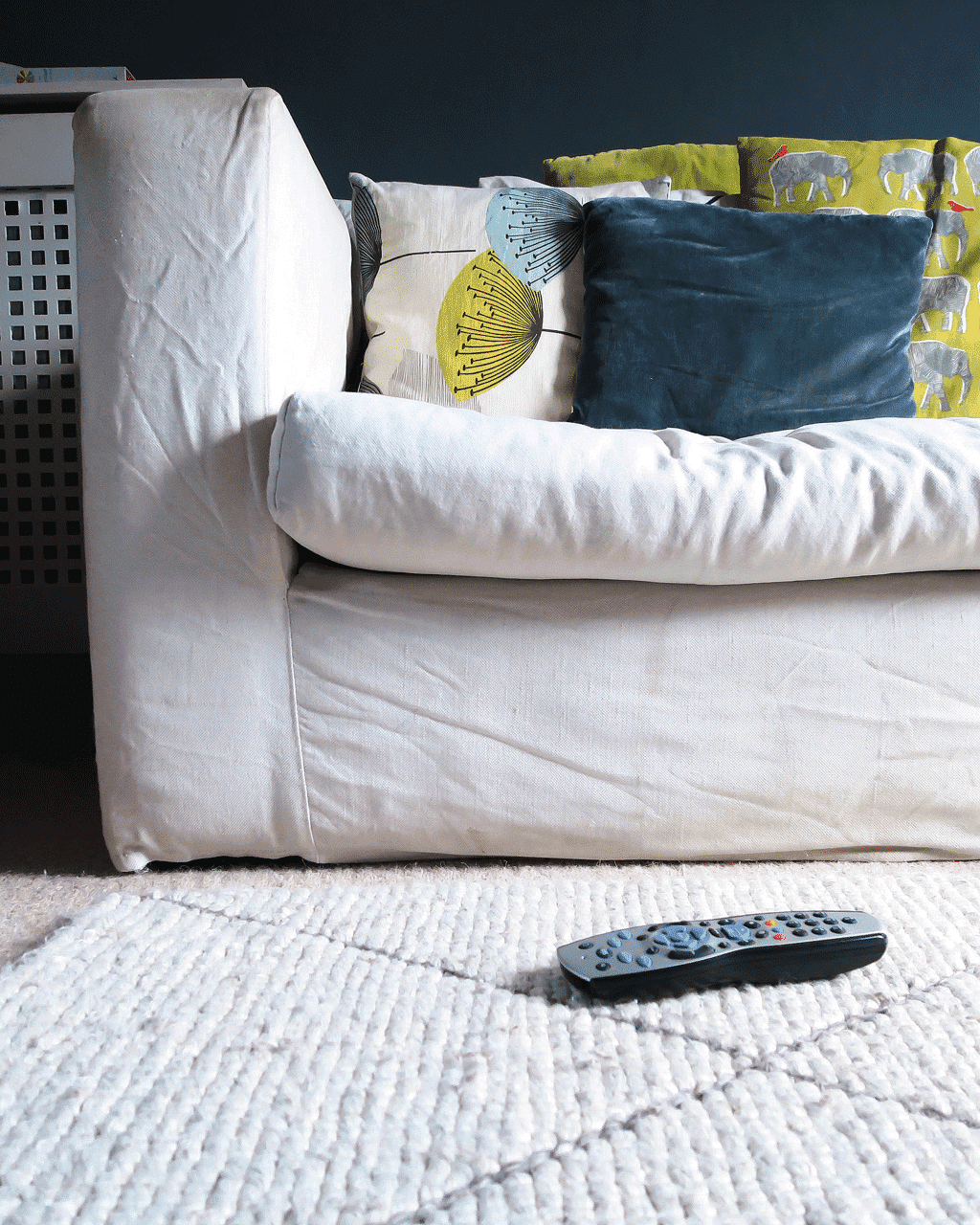
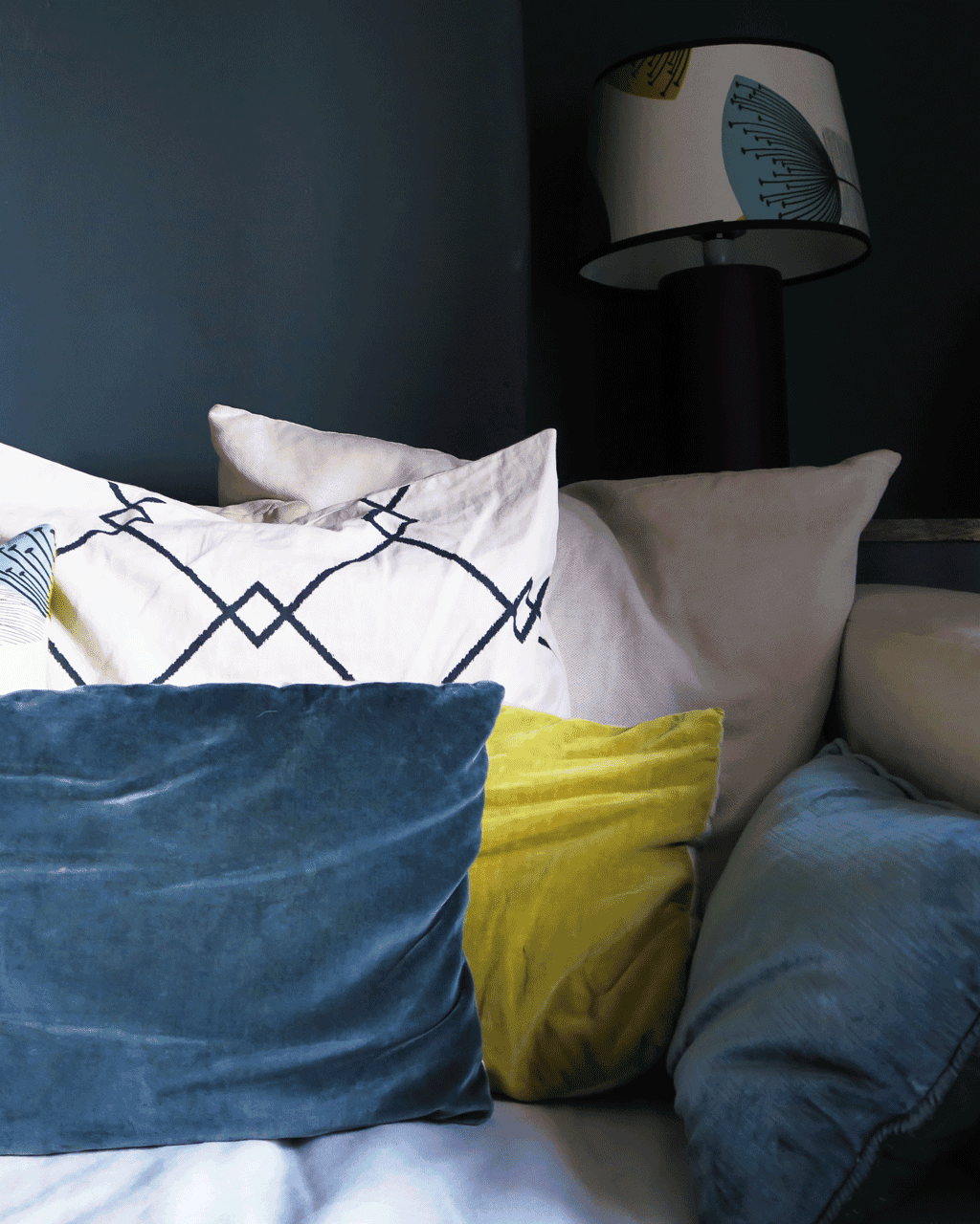
Well, the inky tones have had exactly the same result in our home; the dark walls have the added benefit of making our tired old sofa — whose cover’s have been through the wash more times than I can count on both hands — look brighter and less grubby.
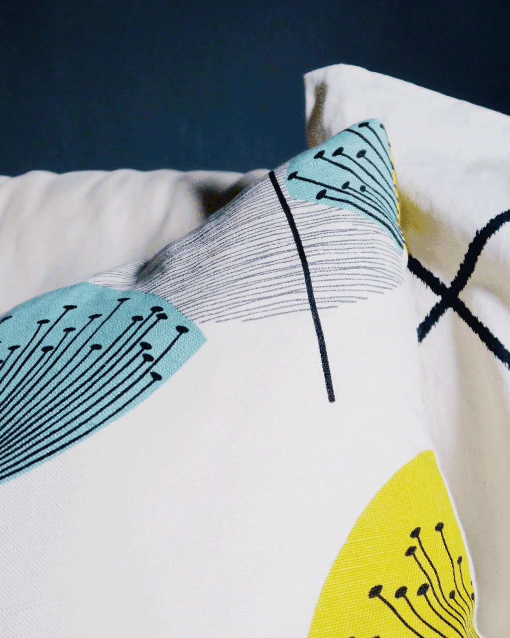
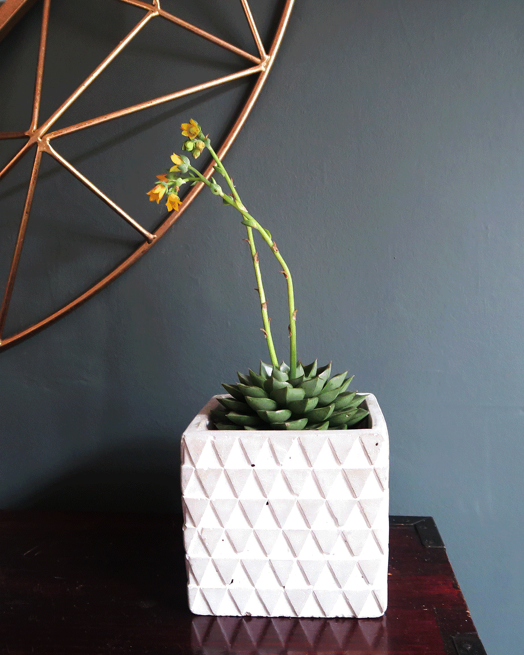
And the teals and chartreuse accents, that were so lost against the pale walls, look vivid and vibrant.
The dark walls have given the space a personality.
And whilst it is naturally a fairly dingy room — even on a bright day — light comes from other sources. Which make our little snug feel rich and splendid; rather than dowdy and dull.
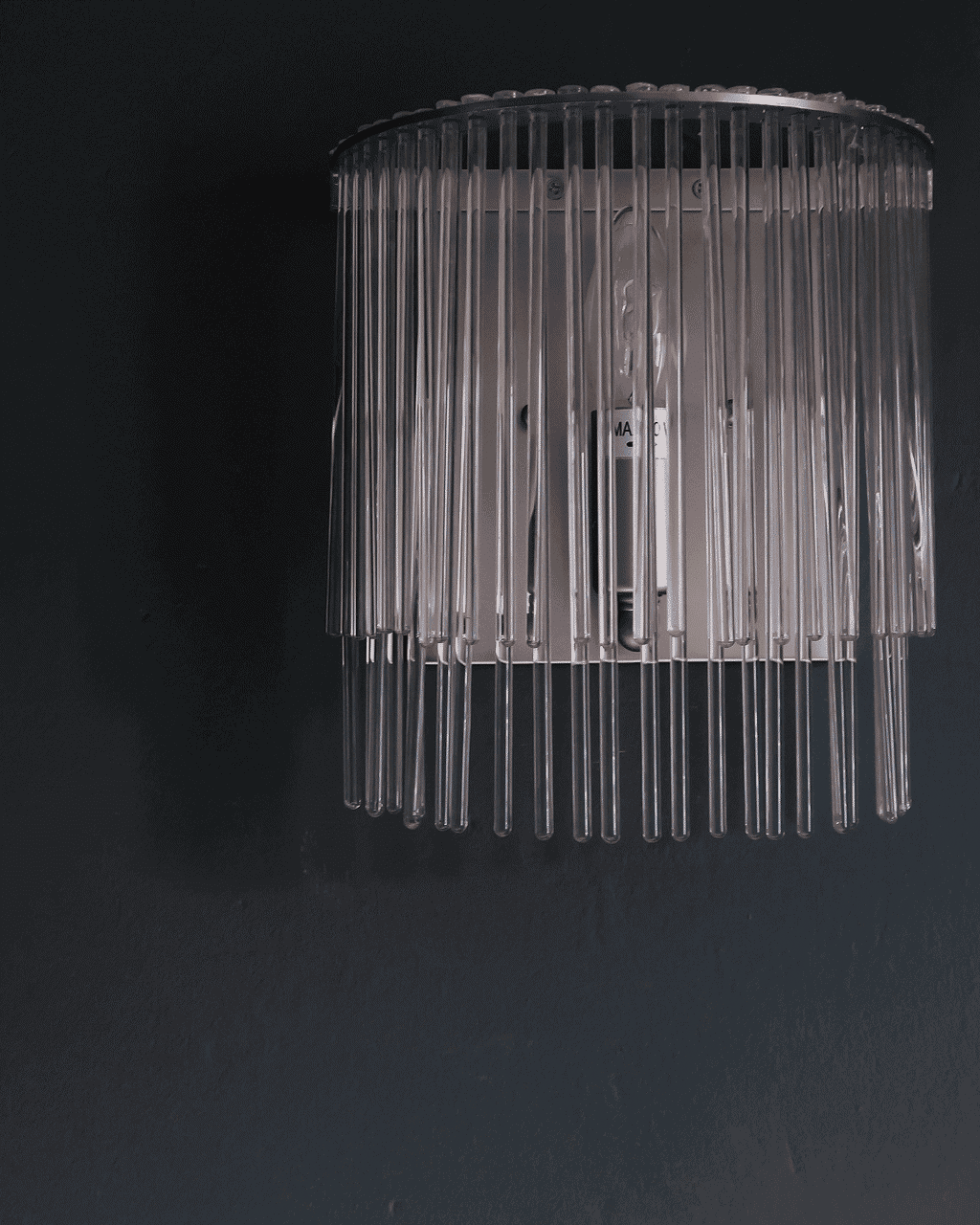
We’ve always had two little wall lights in there, made up of lots of glass strands that dangle down. They’re unusual — a little bit Art Deco in feel — but they were lost on the pale walls.
Now they sparkle and shine against the inky grey.
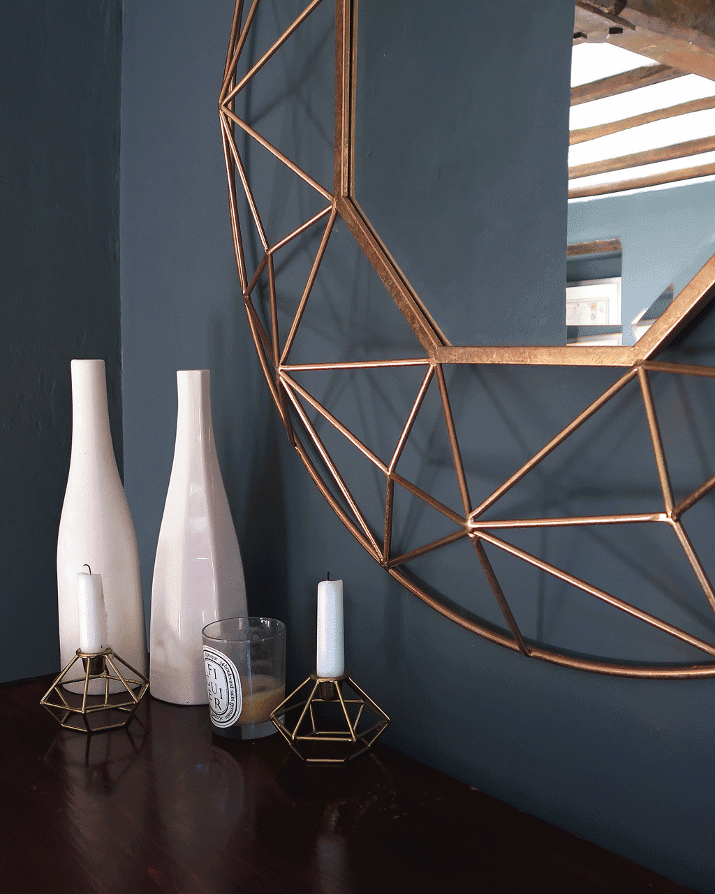
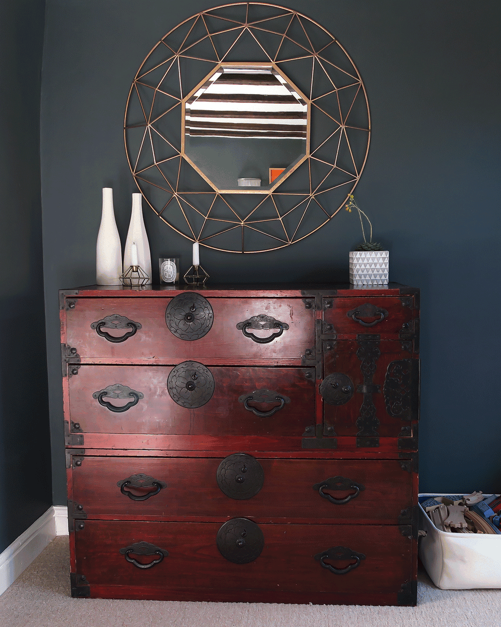
And we’ve added a beautiful geometric mirror in the darkest corner; that bounces the light around and gives cheeky glimpses of a looking glass room beyond.
Mirror, mirror on the wall.
I love the circular frame. The open, geometric shapes that show the dark walls beneath. It’s like a work of art in it’s own right.
Our little snug is the most multifunctional room in the house — but multifunctional shouldn’t mean ordinary.
The boys have most of their toys in there; they play in there. We watch TV in there. Read the papers, snuggle on the sofa. Generally chill out in there.
But instead of utilitarian, the tone of the walls and striking mirror have totally elevated the feel of the room.
I’m not sure that my art teacher quite had interior design in mind, when she taught us about chiaroscuro, but I think she’d agree that this is a good example!
Thank you so much to Exclusive Mirrors for sending us the beautiful Andromeda Mirror for the purposes of styling this post. We love it!
This is a collaborative post but all thoughts, words and images and styling — as ever — are entirely my own.

Caro Davies is a former art-director turned writer and content-creator, and editor behind UK lifestyle blog The Listed Home. She writes about home-related topics, from interiors and DIY to food and craft. The Listed Home has been featured in various publications, including Ideal Home, Grazia, and Homes & Antiques magazines.
- Caro Davies
- Caro Davies
- Caro Davies
- Caro Davies
- Caro Davies
- Caro Davies
- Caro Davies
- Caro Davies
- Caro Davies
- Caro Davies
- Caro Davies
- Caro Davies
- Caro Davies
- Caro Davies
- Caro Davies
- Caro Davies
- Caro Davies
- Caro Davies
- Caro Davies
- Caro Davies
- Caro Davies
- Caro Davies
- Caro Davies
- Caro Davies
- Caro Davies
- Caro Davies
- Caro Davies
- Caro Davies
- Caro Davies
- Caro Davies
- Caro Davies
- Caro Davies
- Caro Davies
- Caro Davies
- Caro Davies
- Caro Davies
- Caro Davies
- Caro Davies
- Caro Davies
- Caro Davies
- Caro Davies
- Caro Davies
- Caro Davies
- Caro Davies
- Caro Davies
- Caro Davies
- Caro Davies
- Caro Davies
- Caro Davies
- Caro Davies
- Caro Davies
- Caro Davies
- Caro Davies
- Caro Davies
- Caro Davies
- Caro Davies
- Caro Davies
- Caro Davies
- Caro Davies
- Caro Davies
- Caro Davies
- Caro Davies
- Caro Davies
- Caro Davies
- Caro Davies
- Caro Davies
- Caro Davies
- Caro Davies
- Caro Davies
- Caro Davies
- Caro Davies
- Caro Davies
- Caro Davies
- Caro Davies
- Caro Davies
- Caro Davies
- Caro Davies
- Caro Davies
- Caro Davies
- Caro Davies
- Caro Davies
- Caro Davies
- Caro Davies
- Caro Davies
- Caro Davies
- Caro Davies
- Caro Davies
- Caro Davies
- Caro Davies
- Caro Davies
- Caro Davies
- Caro Davies
- Caro Davies
- Caro Davies
- Caro Davies
- Caro Davies
- Caro Davies
- Caro Davies
- Caro Davies
- Caro Davies
- Caro Davies
- Caro Davies
- Caro Davies
- Caro Davies
- Caro Davies
- Caro Davies
- Caro Davies
- Caro Davies
- Caro Davies
- Caro Davies
- Caro Davies
- Caro Davies
- Caro Davies
- Caro Davies
- Caro Davies
- Caro Davies
- Caro Davies
- Caro Davies
- Caro Davies
- Caro Davies
- Caro Davies
- Caro Davies
- Caro Davies
- Caro Davies
- Caro Davies
- Caro Davies
- Caro Davies
- Caro Davies
- Caro Davies
- Caro Davies
- Caro Davies
- Caro Davies
- Caro Davies
- Caro Davies
- Caro Davies
- Caro Davies
- Caro Davies
- Caro Davies
- Caro Davies
- Caro Davies
- Caro Davies
- Caro Davies
- Caro Davies
- Caro Davies
- Caro Davies
- Caro Davies
- Caro Davies
- Caro Davies
- Caro Davies
- Caro Davies
- Caro Davies
- Caro Davies
- Caro Davies
- Caro Davies
- Caro Davies
- Caro Davies
- Caro Davies
- Caro Davies
- Caro Davies
- Caro Davies
- Caro Davies
- Caro Davies
- Caro Davies
- Caro Davies
- Caro Davies
- Caro Davies
- Caro Davies
- Caro Davies
- Caro Davies
- Caro Davies
- Caro Davies
- Caro Davies
- Caro Davies
- Caro Davies
- Caro Davies
- Caro Davies
- Caro Davies
- Caro Davies
- Caro Davies
- Caro Davies
- Caro Davies
- Caro Davies
- Caro Davies
- Caro Davies
- Caro Davies
- Caro Davies
- Caro Davies
- Caro Davies
- Caro Davies
- Caro Davies
- Caro Davies
- Caro Davies
- Caro Davies
- Caro Davies
- Caro Davies
- Caro Davies
- Caro Davies
- Caro Davies
- Caro Davies
- Caro Davies
- Caro Davies
- Caro Davies
- Caro Davies
- Caro Davies
- Caro Davies
- Caro Davies
- Caro Davies
- Caro Davies
- Caro Davies
- Caro Davies
- Caro Davies
- Caro Davies
- Caro Davies
- Caro Davies
- Caro Davies
- Caro Davies
- Caro Davies
- Caro Davies
- Caro Davies
- Caro Davies
- Caro Davies
- Caro Davies
- Caro Davies
- Caro Davies
- Caro Davies
- Caro Davies
- Caro Davies
- Caro Davies
- Caro Davies
- Caro Davies
- Caro Davies
- Caro Davies
- Caro Davies
- Caro Davies
- Caro Davies
- Caro Davies
- Caro Davies
- Caro Davies
- Caro Davies
- Caro Davies
- Caro Davies
- Caro Davies

Oh just wow! It’s fab Caro!
What a gorgeous room and the mirror is the perfect finishing touch.
Xx
#HomeEtc
Thanks so much lovely xx
I totally agree with you on the dark paint front – our littlest bedroom that we turned into our home office was white when we moved in. We painted it dark grey and it makes the room feel so much bigger!! Love what you’ve done here and that mirror is just gorgeous! X
Aah thanks Lins — I’m so pleased with it. It was a dark grey for years — not quite as dark as this though. What possessed me to paint it in a pale shade, I’ve no idea. SO happy to have gone back over to the dark side!! ;)
I love this Caro. The colour and the accessories. And, of course, I want to eat the mirror. It all really works and funnily enough I know keep seeing the colour wherever I go! #HomeEtc
Aaah me TOO — the mirror is totally edible!! LOL!! We’ve had the accessories for donkey’s years but the addition of the dark grey has totally given them a new lease of life! :)
The dark colour has worked so well, I love how bright the colours look against it. The hubby wanted a darker shade of grey in oir kitchen which I was against at first but it looks so good against the cream cupboards. Ours is not as dark as yours but it’s definitely darker than I wanted but I love it!
It’s amazing isn’t it? Colours really pop against a lovely dark grey. Everything was looking so washed out before — it’s made the world of difference :)
It looks gorgeous Caro, and isn’t it strange how a darker colour can make it look bigger and make it sing. Definitely a snug snug now :) Thanks for hosting x
Thanks so much lovely. I’m so pleased with it!!
It looks gorgeous Caro and I love the new style you have in your home – SO chic :) Looking gorgeous and the design if beautiful. xx
#HomeEtc
Thanks treasure — amazing what a differece a change of colour can do to bring all your old furnshings up to date xx
It looks glorious. I love the colour and the mirror is beautiful!
Thanks chickie :) So pleased with it!
Oh wow that mirror is amazing. I think you need dark for a snug, so it’s cosy and loving the bright colours with it.
Eilidh x
Thanks so much lovely!! Yes — I agree — the pale and interesting look didn’t work at all for our little snug!!
That looks phenomenal! I didn’t think dark paint can make small rooms larger. My place has very little light so it wouldn’t be true for me. I definitely should stick with light paints :)
I like the idea of white furniture + dark walls. When you look at many scandinavian-like designs, everything there is white. It is very sterile. Your place definitely has a character.
Thanks so much Ann — that’s so kind of you :)
Not many people talk about chiaroscuro, and I think it’s so beautiful… I have a soft spot for dark environments, and these ideas are a nice compromise between light and dark – I can be dark and still not make my room look like the batcave. Thanks for the post!
It’s something that my art teacher always used to talk about and it’s really stuck with me!! So lovely that you can balance out light and dark — even at home. Haha! I love the batcave reference!! My boys are superhero obsessed — I think they’d have loved that!!! LOL! Thanks so much for stopping by and taking the time to comment Maisha :)