The next in my Colour Your World series is Pantone Lilac Gray.
Of all the colours I’ve showcased so far, it has been the most difficult to source products for.
Slightly more red than standard ‘grey’, this warmed up shade has definitely more than just a hint of lavender.
It’s such a beautiful, restful colour — and I found quite a few interior pieces to fit the brief — but fashion was a different story altogether. Although grey is HUGE at the moment, most of the pieces available online are your bog-standard school uniform kinda grey.
Not this subtly different shade.
So please bear with me. Whilst these picks are not ‘exactly’ Pantone Lilac Gray, they certainly give a flavour of it.
The gorgeous sneakers from Air and Grace are a winner — they’re metallic silver leather but have the most amazing iridescent detailing that looks silver-grey in some lights, lilac in another, so I figured that was all bases covered!
Colour Your World | #23 Pantone Lilac Gray
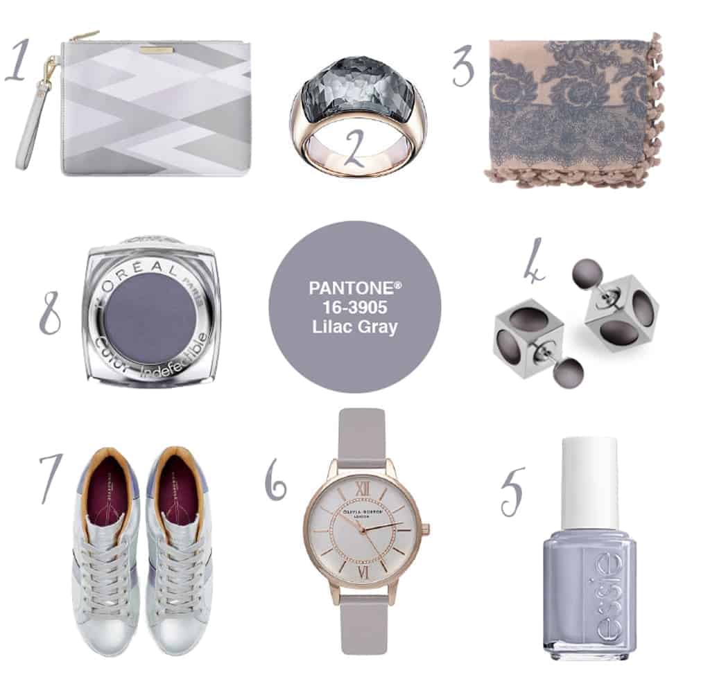
1. Geo Print Clutch — Katie Loxton
2. Dome Ring — Swarovski
3. Scarlett Rose Print Pom-Pom Scarf — Jigsaw
4. Tribales Earings — Dior
5. Cocktail Bling Nail Polish — Essie
6. Olivia Burton Watch — Hugh Rice
7. Copeland Sneakers — Air & Grace
8. Pebble Gray Eyeshadow — L’Oreal
I love how well the rose-gold tone goes with this lilaccy-gray shade too; silver definitely enhances the ‘greyness’ whilst the addition of the coppery warmth of rose-gold increases the lilac hue.
It’s most definitely an easy to wear colour too — unlike Buttercup or Tangerine, for example.
Especially those gorgeous kicks from Air and Grace. I do love a metallic shoe ;)
Next time, we’ll be looking at:

Caro Davies is a former art-director turned writer and content-creator, and editor behind UK lifestyle blog The Listed Home. She writes about home-related topics, from interiors and DIY to food and craft. The Listed Home has been featured in various publications, including Ideal Home, Grazia, and Homes & Antiques magazines.
- Caro Davies
- Caro Davies
- Caro Davies
- Caro Davies
- Caro Davies
- Caro Davies
- Caro Davies
- Caro Davies
- Caro Davies
- Caro Davies
- Caro Davies
- Caro Davies
- Caro Davies
- Caro Davies
- Caro Davies
- Caro Davies
- Caro Davies
- Caro Davies
- Caro Davies
- Caro Davies
- Caro Davies
- Caro Davies
- Caro Davies
- Caro Davies
- Caro Davies
- Caro Davies
- Caro Davies
- Caro Davies
- Caro Davies
- Caro Davies
- Caro Davies
- Caro Davies
- Caro Davies
- Caro Davies
- Caro Davies
- Caro Davies
- Caro Davies
- Caro Davies
- Caro Davies
- Caro Davies
- Caro Davies
- Caro Davies
- Caro Davies
- Caro Davies
- Caro Davies
- Caro Davies
- Caro Davies
- Caro Davies
- Caro Davies
- Caro Davies
- Caro Davies
- Caro Davies
- Caro Davies
- Caro Davies
- Caro Davies
- Caro Davies
- Caro Davies
- Caro Davies
- Caro Davies
- Caro Davies
- Caro Davies
- Caro Davies
- Caro Davies
- Caro Davies
- Caro Davies
- Caro Davies
- Caro Davies
- Caro Davies
- Caro Davies
- Caro Davies
- Caro Davies
- Caro Davies
- Caro Davies
- Caro Davies
- Caro Davies
- Caro Davies
- Caro Davies
- Caro Davies
- Caro Davies
- Caro Davies
- Caro Davies
- Caro Davies
- Caro Davies
- Caro Davies
- Caro Davies
- Caro Davies
- Caro Davies
- Caro Davies
- Caro Davies
- Caro Davies
- Caro Davies
- Caro Davies
- Caro Davies
- Caro Davies
- Caro Davies
- Caro Davies
- Caro Davies
- Caro Davies
- Caro Davies
- Caro Davies
- Caro Davies
- Caro Davies
- Caro Davies
- Caro Davies
- Caro Davies
- Caro Davies
- Caro Davies
- Caro Davies
- Caro Davies
- Caro Davies
- Caro Davies
- Caro Davies
- Caro Davies
- Caro Davies
- Caro Davies
- Caro Davies
- Caro Davies
- Caro Davies
- Caro Davies
- Caro Davies
- Caro Davies
- Caro Davies
- Caro Davies
- Caro Davies
- Caro Davies
- Caro Davies
- Caro Davies
- Caro Davies
- Caro Davies
- Caro Davies
- Caro Davies
- Caro Davies
- Caro Davies
- Caro Davies
- Caro Davies
- Caro Davies
- Caro Davies
- Caro Davies
- Caro Davies
- Caro Davies
- Caro Davies
- Caro Davies
- Caro Davies
- Caro Davies
- Caro Davies
- Caro Davies
- Caro Davies
- Caro Davies
- Caro Davies
- Caro Davies
- Caro Davies
- Caro Davies
- Caro Davies
- Caro Davies
- Caro Davies
- Caro Davies
- Caro Davies
- Caro Davies
- Caro Davies
- Caro Davies
- Caro Davies
- Caro Davies
- Caro Davies
- Caro Davies
- Caro Davies
- Caro Davies
- Caro Davies
- Caro Davies
- Caro Davies
- Caro Davies
- Caro Davies
- Caro Davies
- Caro Davies
- Caro Davies
- Caro Davies
- Caro Davies
- Caro Davies
- Caro Davies
- Caro Davies
- Caro Davies
- Caro Davies
- Caro Davies
- Caro Davies
- Caro Davies
- Caro Davies
- Caro Davies
- Caro Davies
- Caro Davies
- Caro Davies
- Caro Davies
- Caro Davies
- Caro Davies
- Caro Davies
- Caro Davies
- Caro Davies
- Caro Davies
- Caro Davies
- Caro Davies
- Caro Davies
- Caro Davies
- Caro Davies
- Caro Davies
- Caro Davies
- Caro Davies
- Caro Davies
- Caro Davies
- Caro Davies
- Caro Davies
- Caro Davies
- Caro Davies
- Caro Davies
- Caro Davies
- Caro Davies
- Caro Davies
- Caro Davies
- Caro Davies
- Caro Davies
- Caro Davies
- Caro Davies
- Caro Davies
- Caro Davies
- Caro Davies
- Caro Davies
- Caro Davies
- Caro Davies
- Caro Davies
- Caro Davies
- Caro Davies
- Caro Davies
- Caro Davies
- Caro Davies
- Caro Davies
- Caro Davies
- Caro Davies
- Caro Davies
- Caro Davies
- Caro Davies
- Caro Davies
- Caro Davies
- Caro Davies

You’d be surprised! When I went to a Farrow and Ball talk a couple of year’s ago, Joa Studholme — their colour consultant — said use a strong colour in your hall so that you create ultimate impact on arrival. She said it also means that all the rooms off the hall look brighter and bigger, as a result. Giving you licence to be more neutral in the rest of the house. Try it — I bet it would look fab!